In recent years, websites have begun to shift their designs towards the concept of “responsive web design” to accommodate for the growing mobile market. This approach allows a single website to adapt its layout and visuals to suit the screen size that it is viewed on. The popularity of this approach has seen frameworks such as Twitter Bootstrap and Foundation become the unofficial defaults for implementing web design. To avoid confusion between input response times (also known as “responsiveness”) in video games, from here on I’ll be using the word “adaptive” to refer to this UI pattern.
mini2Dx 1.3.0 introduced support for adaptive user interface layout but also added an adaptive input system allowing UI navigation and input to also adapt to the device that the video game is running on. The result is that developers can implement their UI once and use it on every platform with little to no platform-specific code.
The following blog post explains how the framework achieves this but since mini2Dx is open-source it is also possible to dive into source code at its repository and see how it works.
The first goal during 1.3.0 development was to achieve adaptive rendering of the UI. Luckily, web browsers already solved this via layout engines so a similar engine was implemented in mini2Dx. To build the engine, first we need to define UI elements.
UI Elements
Every UI element rendered to screen consists of two parts; the visual style and the content of the element (which can be child elements). However, these two components are defined separately. In web programming, these are your CSS and HTML files.
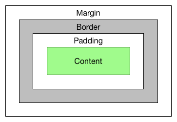
First, we define the style rules. Every element - when rendered - follows the standard web box model consisting of background (defaulting to no background), margin (defaulting to 0), padding (defaulting to 0), border (defaulting to 0) and content (defaulting to no content). The relation of these properties can be seen in the following diagram. Backgrounds are rendered inside the border.
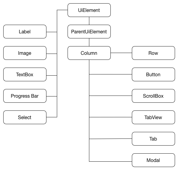
Next we’ll define the content model. In mini2Dx, all UI elements extend a common class named UiElement. There are 5 base elements - Labels, Images, TextBoxes, Progress Bars and Select Boxes - which extend UiElement directly and have no child elements. Every other element is a child-holding element that extends a ParentUiElement class.
The result is a class hierarchy that looks like the following diagram.
To improve maintainability and to separate render logic from content structure, the framework separates the content tree from the render tree. Once again, this is similar to how browsers separate the Document Object Model (DOM) from the render tree.
Layout & Render
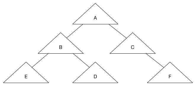
Every UiElement is connected to a RenderNode. A RenderNode has a width, height and a position relative to its parent. To prevent unnecessary updating of the render tree and to also optimise layout updating during content changes, the render tree makes use of a dirty bit system. That is, when an element changes content, it marks its RenderNode as dirty. This in turn marks its parent, its grandparent, and all other ancestors as dirty. The benefit of this mechanism is that other leaves of the render tree will not have a layout operation unless sizing changes have an effect on other elements. Consider the following element tree, where all elements are currently clean.
Then element E is set to dirty due to a content change.
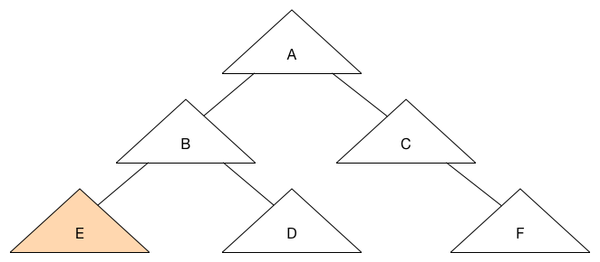
This in turn sets its ancestors as dirty.
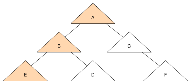
As you can see, the elements C, D and F will not be set to dirty, reducing the number of layout operations required.
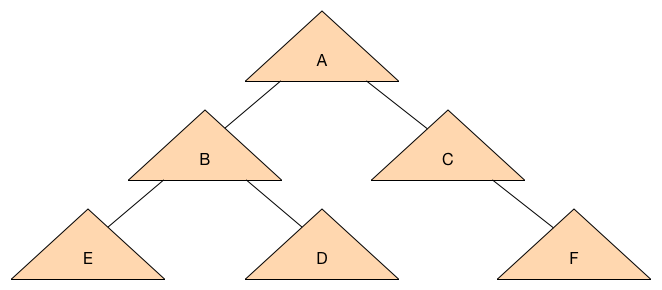
Let’s start with a clean state again and set A as dirty due to a styling change.
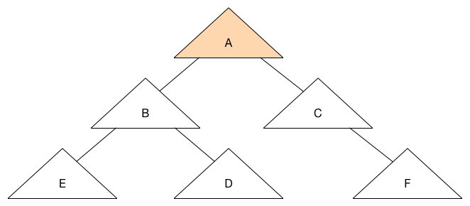
Since the size of A affects its child elements, all child elements become dirty which results in the following tree state.
Now that we can propagate changes efficiently to the render tree, we can begin working on the layout operation. Take the following pseudo-code as our starting point.
UiElement {
	RenderNode renderNode;
}

ParentUiElement extends UiElement {
}

RenderNode {
	UiElement element;
	boolean dirty = false;
	float relativeX, relativeY;
	float width, height;
}
One part we haven’t discussed yet is how to handle adaptiveness. To achieve this, mini2Dx follows Bootstrap’s design and assumes all ParentUiElements will have a column size with a maximum value of 12. That is, every parent element is split into 12 columns which its children can occupy, and this is applied recursively. To achieve adaptiveness of the UI, mini2Dx allows multiple parentWidth values to be applied to the element and a different one is used depending on the device. It also assumes a size of 0 means that the element is hidden.
For simplicity of explaining the layout operation, we’ll only add a single field for this to the ParentUiElement.
ParentUiElement extends UiElement {
	int columnSize;
}
We also need to keep track of width as we layout the tree, so we’ll add a LayoutState class for this.
LayoutState {
	int parentWidth;
}
Now we’re ready to implement the layout logic in the RenderNode. This is a recursive function, so I’m going to add the logic as pseudo-code below.
RenderNode {
	UiElement element;
	boolean dirty = false;
	int relativeX, relativeY;
	int width, height;

	function layout(LayoutState state) {
		if(!dirty) {
			return;
		}
		determineStyleRules();
		determinePreferredContentWidth();

		int parentWidth = state.getParentWidth();
		state.setParentWidth(getPreferredContentWidth());

		int startX = 0;
		for(UiElement child : children) {
			child.renderNode.layout(state);
			child.renderNode.setRelativePositionToParent(startX, width);
			x += child.renderNode.width;
		}

		state.setParentWidth(parentWidth);
		determinePreferredContentHeight();
		dirty = false;
	}

	function determinePreferredContentWidth(LayoutState state) {
		if(element is UiParentElement) {
			width = (state.getParentWidth() / 12) * columnSize;
		} else {
			width = getContentWidth();
		}
	}

function determinePreferredContentHeight() {
		int maxHeight = 0;
		for(UiElement child : children) {
			if(child.renderNode.relativeY + child.height > maxHeight) {
				maxHeight = child.renderNode.relativeY + child.renderNode.height;
			}
		}
		height = maxHeight;
	}

	function setRelativePositionToParent(x, parentWidth) {
		//Compute position relative to other elements at same level in tree - wrapping if necessary
		relativeX = x % parentWidth;
		relativeY = x / parentWidth;
	}
}
Starting from the root element, we pass the LayoutState into the tree with its parentWidth value set to the width of the screen. From there we proceed recursively through the tree calculating the size and position of each child element. When the layout operation is complete the render tree is ready for rendering. This is easily implemented since we have the relative positions of each element to their parent element. In mini2Dx, the game window acts as the root parent element.
function render(ParentUiElement parent) {
	renderX = parent.renderNode.renderX + relativeX;
	renderY = parent.renderNode.renderY + relativeY;

	if(element is UiParentElement) {
		for(UiElement child : children) {
			child.render(this);
		}
	} else {
		//Render content at renderX, renderY
	}
}
This logic can then be extended to add background rendering, padding, margins, etc. from the style rules.
Now that we’ve designed a layout engine that supports Adaptive UI, our next goal is to handle adaptive UI navigation and input handling.
Adaptive Input
mini2Dx’s adaptive input mechanism assumes 3 possible input methods; Keyboard/Mouse, Touchscreen and Gamepad. For keyboard and gamepads, it also supports mapping elements as hotkeys.
First each input element (Button, TextBox, etc.) must store their action state:
From here we can implement a Navigation interface with multiple implementations. The following pseudo-code is similar to the mini2Dx interface:
Navigation {
	void setHotKey(int keycode, UiElement element)

	//Sets navigation - where 0 is the first element
	void setNavigation(int index, UiElement element)

	//If returns null, call navigate
	RenderNode hotkey(int keycode);

	RenderNode navigate(int keycode);
}
For gamepads, you can map the axis and buttons to keyboard buttons, or, implement explicit functions for these. However, the important part (depending on your implementation) is to return the currently highlighted render node when keys are pressed, so that you can trigger the Active state when subsequent keys are pressed.
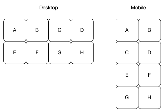
From here your Navigation interface can be implemented and also be adaptive based on the UI layout as horizontal elements can wrap to new rows. For example, grid-based navigation works adaptively as follows:
Conclusion
While nothing here is groundbreaking, I feel the combination of these ideas into a single UI framework can significantly reduce cross-platform development time for developers and free them to focus more on other aspects of their game.
If you’d like to learn more about mini2Dx’s implementation, the documentation can be found on the mini2Dx wiki. If you have any questions I can be reached at @tom_cashman.
An easy to use API with powerful features and plugins to help you build your next game